
Join us as we discuss the latest updates on UI styling, DevTools, and the evolution of responsive design.
The landscape of web development is undergoing a significant transformation with the advent of The New Responsive Design, which redefines how we approach adaptability across various devices and screen sizes. By adopting a mobile-first strategy, this innovative design paradigm places paramount importance on mobile usability, ensuring seamless performance and accessibility.
Key advancements such as CSS Variables and enhanced debugging tools streamline the development process, fostering dynamic styling and efficient troubleshooting. As we explore these updates and their implications, it becomes evident that a deeper understanding of this evolution is essential for creating more engaging and inclusive digital experiences.
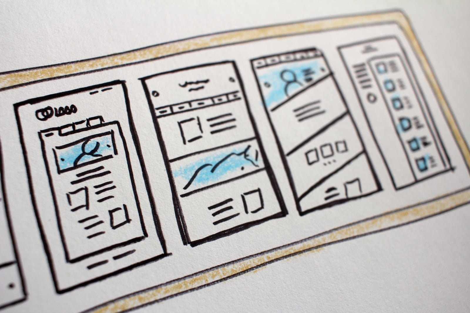
Responsive design is a web development approach that guarantees content adapts seamlessly to various screen sizes and devices, enhancing user experience across all platforms. Emphasizing mobile usability, it ensures that websites are equally functional on smartphones, tablets, and desktops.
This is achieved through adaptive layouts that adjust elements fluidly depending on the screen’s dimensions. The evolution from fixed layouts to fluid grids and flexible images marks significant progress in creating more inclusive and versatile web experiences.
By adopting a mobile-first approach, developers prioritize the performance and accessibility of content on smaller screens, thereby catering to the growing number of mobile users. Future trends like AI integration promise further personalization and adaptability in responsive design.
How are the latest CSS features revolutionizing UI styling in responsive design? The advent of CSS Variables allows for dynamic and adaptable styling, streamlining the process of maintaining consistent design elements across various screen sizes.
By enabling developers to define and reuse variables for colors, fonts, and spacing, CSS Variables greatly reduce redundancy and enhance scalability. Additionally, advancements in color accessibility, such as the CSS accent-color property, guarantee that interfaces remain inclusive by providing better contrast and visibility for users with visual impairments.
These innovations not only improve aesthetic consistency but also promote usability and accessibility in responsive design, leading to more engaging and user-friendly web experiences.
Building on the advancements in UI styling, recent updates to DevTools offer powerful features for developers to fine-tune and optimize responsive designs effectively.
These enhancements include advanced debugging techniques and performance optimization tools, which are essential for ensuring a seamless user experience across various devices.
Chrome DevTools, for instance, now includes Device Mode for simulating different devices and Performance Metrics for evaluating site speed and responsiveness.
The CSS Grid Inspector assists in managing intricate layouts, while Lighthouse Integration provides automated audits for accessibility, performance, and SEO.
| Feature | Function | Benefit |
|---|---|---|
| Device Mode | Simulates various devices | Enhances testing |
| Performance Metrics | Measures loading speed | Boosts site performance |
| CSS Grid Inspector | Manages complex layouts | Simplifies grid design |
| Lighthouse | Automated audits | Improves overall quality |
Designing for multiple devices requires careful consideration to avoid common pitfalls that can compromise the user experience. In the quest to enhance user engagement, designers often encounter several recurring issues. Here are some key design pitfalls to watch out for:
For those seeking to enhance their expertise in responsive design, a wealth of resources is available to facilitate learning and skill development. Online workshops offer interactive, hands-on experiences, allowing participants to apply new techniques in real-time.
These workshops often feature industry experts who provide valuable insights into current trends and best practices. Additionally, design podcasts serve as an excellent tool for continuous learning, offering discussions on emerging technologies and design philosophies.
Platforms like Coursera and Udemy provide thorough online courses tailored to various skill levels.Community forums such as Stack Overflow and Designer Hangout foster collaborative learning and problem-solving.
Moreover, documentation from W3C and MDN Web Docs offers authoritative guidance on web standards and responsive design principles.
Watch all Chrome Developer Summit videos →
Subscribe to Google Chrome Developers →
Responsive design considerably impacts website SEO by improving mobile optimization and enhancing user experience. Search engines favor sites that provide seamless navigation across devices, which can lead to higher rankings and increased organic traffic.
For implementing fluid grids, utilize fluid grid frameworks to guarantee design consistency across devices. Employ adaptive layout techniques to dynamically adjust content, enhancing user experience and accessibility while maintaining a cohesive visual structure.
Responsive design affects website maintenance by introducing maintenance challenges such as ensuring consistent design updates across various devices and screen sizes, requiring thorough testing and adaptation to new technologies to maintain ideal user experience.
Content prioritization, through effective content hierarchy, plays a crucial role in responsive design by ensuring essential information is prominently displayed, thereby enhancing user experience across devices. This approach optimizes navigation and accessibility, improving overall engagement.
Responsive design principles can be applied to web applications by ensuring fluid layouts and flexible images, prioritizing user experience, and enhancing mobile accessibility. This involves leveraging scalable UI components and testing across various devices for peak performance.
The New Responsive Design paradigm greatly advances web development by prioritizing mobile usability and adaptability across diverse devices. By employing fluid grids, flexible images, and leveraging innovations such as CSS Variables and enhanced debugging tools, it guarantees peak performance and accessibility.
This shift from fixed layouts fosters more engaging and inclusive web experiences. Embracing these advancements mitigates common design mistakes and equips developers with the tools necessary for creating dynamic, user-centered websites.


